
Our Favorite Benjamin Moore Colors for Fall 2025
- Joshua Allen Design Team

- Oct 17, 2025
- 5 min read
By Joshua Allen Design
As the leaves change colors and the crisp air settles in, it’s time to think about how we can bring the spirit of fall into our homes. The colors we choose significantly influence our surroundings, setting the mood and creating a welcoming atmosphere. At Joshua Allen Design, we believe that selecting the right colors can transform your space into a cozy retreat perfect for the season. In this post, we’ll explore our favorite Benjamin Moore colors for Fall 2025. We'll focus on warm, grounding tones and subtle, sophisticated neutrals that can elevate your home's aesthetic this season.

The Importance of Color This Fall
Color serves as more than just a visual enhancement; it can evoke emotions and shape our daily experiences. As we embrace the fall season, choosing the right colors for our homes can create a sense of comfort and serenity. Warm tones can make a room feel inviting, while cooler hues can add depth and elegance.
At Joshua Allen Design, we carefully choose colors based on their mood, lighting, and overall design. This fall, we are excited to incorporate a palette that reflects the beauty of the season, combining warm neutrals, deep, moody shades, and understated accent colors. Thoughtfully incorporating these colors into your home can create a cohesive environment that resonates with the essence of fall.
Popular Benjamin Moore Colors for Fall 2025
A. Warm Neutrals
This fall, warm neutrals are stealing the spotlight. Soft taupes, creamy whites, and muted beiges create an inviting backdrop that works beautifully in various spaces like living rooms, kitchens, and entryways. These colors are not only calming but also versatile for decorating purposes.
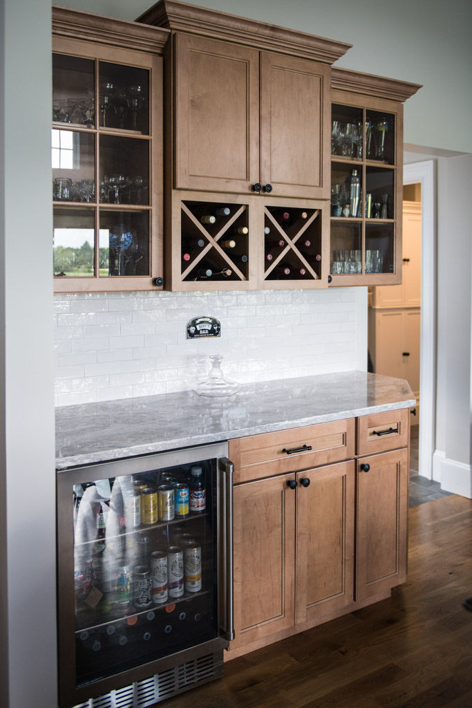
For instance, envision a cozy living room painted in soft taupe, complemented by plush furniture featuring warm textiles in rich browns and burnt oranges. Brightening your kitchen with creamy whites can give it an airy and spacious feel, making it the ideal place for gatherings. Muted beige creates a warm welcome in an entryway, ensuring guests feel at home the moment they step inside.
B. Deep, Moody Hues
If you're looking to create a more dramatic atmosphere, deep, moody hues are a fantastic choice. Shades like rich blues, forest greens, and warm charcoals can transform spaces into cozy retreats, perfect for bedrooms and dining rooms or even as eye-catching accent walls.
Imagine a bedroom adorned in deep forest green, complemented by soft linens in muted tones and warm wood accents. A dining room painted in rich blue can become a focal point for family meals, encouraging connection and conversation. Warm charcoals, used thoughtfully, can add depth to a space, making it feel both inviting and sophisticated.
C. Subtle, Muted Accent Colors
Incorporating subtle, muted accent colors can add a touch of personality to your home without overwhelming the space. Soft terracotta, dusty rose, and muted gold tones work beautifully for cabinetry, furniture, or decorative accents, bringing warmth and character.
Picture a kitchen featuring soft terracotta cabinetry paired with neutral countertops and warm wood elements. A dusty rose accent chair in a cozy reading nook can create an inviting atmosphere. Muted gold decorative accents, like picture frames or lamps, can impart a sense of elegance to your living space.
D. Fresh, Natural Inspirations
This fall, let’s draw inspiration from the stunning colors found in New England’s foliage. Shades like amber, cinnamon, and muted olive can tie your interiors to the season, producing a cohesive aesthetic. These fresh, natural colors reflect the essence of fall and can be integrated into your home seamlessly.
Consider an accent wall painted in warm amber, echoing the hues of autumn leaves, or a muted olive sofa that connects your indoors with the great outdoors. These colors can enhance the overall ambiance and create a harmonious atmosphere in your home.
Intentional Color Use in Your Home
To incorporate these trending colors thoughtfully, consider these recommendations for a balanced and cohesive look:
Layer Neutrals with Bold Accents: Start with a neutral base and then introduce bold accent colors for added interest. A soft beige living room can be made lively with deep blue throw pillows or a rich green rug.
Consider Lighting and Textures: The way light interacts with colors can change their appearance. Natural light can highlight the warmth in neutral tones, while artificial light may alter the mood of richer shades. Pairing colors with various textures, such as soft fabrics or natural materials, can elevate their impact.
Choosing colors that resonate with your style is also important. Whether you prefer a minimalist approach or a more eclectic style, countless ways exist to integrate these colors into your space.


Our Top Benjamin Moore Picks for Fall 2025
Here are some of our favorite selections for Fall 2025 from Benjamin Moore along with how you can use them in your home:
Soft Taupe (OC-35): A versatile warm neutral perfect for living rooms and kitchens. Pair with rich wood accessories to create a cozy feel.
Deep Forest Green (2036-10): Ideal for creating a relaxing bedroom escape. Combine with soft linens and natural textures for a soothing atmosphere.
Dusty Rose (2094-50): A subtle accent color that brings warmth and character. Use it for an accent chair or decorative pillows in your reading nook.
Warm Charcoal (2117-30): An excellent choice for an accent wall in your dining room. Pair it with wooden furniture for a sophisticated look.
Muted Olive (2140-30): This fresh, natural color can be used for a statement sofa or cabinetry, bridging the indoors with nature.
Amber (2154-30): A warm, inviting shade suitable for an accent wall or decorative accessories, reminiscent of fall foliage.
Creamy White (OC-7): A timeless neutral that brightens up any room, making it perfect for kitchens or entryways for an open feel.
Suggestions for Homeowners
Before finalizing a color choice, sampling swatches in different lighting conditions is vital. Colors can appear radically different depending on the time of day and lighting environment in your home.
Consider utilizing accent walls or cabinetry to test bolder colors. This approach lets you see how the color interacts with your existing décor and natural light.
Incorporating seasonal décor can further enhance your chosen palette. Add warm textiles, natural elements, or decorative accents to reflect the beauty of fall.
Embrace Fall in Your Home
Color updates for the season can uplift your mood, enhance your style, and improve comfort. By adopting the colors of Fall 2025, you can transform your home into a space that feels intentional, harmonious, and timeless. At Joshua Allen Design, we are ready to assist you in selecting and implementing colors that reflect your style while enhancing your living space.
Explore your fall palette with our team or take the Design Quiz to discover your perfect colors. Let’s make this fall a season of transformation and beauty in your home!


Comments