
Winter Paint Inspirations from Joshua Allen Design
- Joshua Allen Design Team

- Dec 20, 2025
- 4 min read
Written by Joshua Allen Design Team
As the air turns crisp and the daylight softens, there’s no better time to refresh your home’s palette. At Joshua Allen Design, we’re embracing the cozy elegance of winter with our favorite seasonal hues, and we’re leaning in full-force on one trusted brand: Benjamin Moore. Why Benjamin Moore? Because quality matters. Their proprietary Gennex® Color Technology ensures deeper, truer pigments that hold up over time, and their vast color system offers the richness and subtlety that elevate a home beyond “just painted.” Their winter-inspired palettes reflect the best of the season; calm neutrals, comforting charcoals, forest greens, crisp icy tones, all thoughtfully selected by their color experts.
Here are five winter-ready paint colors that JAD recommends this season, each chosen for its mood-setting power in the colder months, and all pulled from or inspired by the Benjamin Moore system.
Winter White (2140-70)
This crisp, clean white with a subtle gray cast gives you fresh light even on the shortest winter days. The original Winter White 2140-70 is described as “a crisp white with a subtle gray cast.”


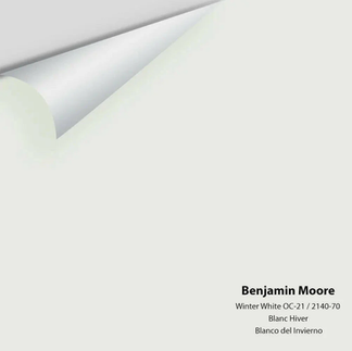


This white that captures that fresh glow of dawn over snow. Ideal for open-plan living rooms, trims and ceilings, or anywhere you want to bounce light.
Why we love it:
It brightens without feeling harsh or sterile; the gray cast adds sophistication.
Works beautifully with warmer woods and metallics (a perfect winter aesthetic).
Versatile: on walls, ceilings, or as contrast for darker accent walls.
Tip: Paint a large sample swatch on your wall and observe it morning-through-evening. White shifts dramatically with daylight and artificial light.

Deep Green (2039-10)
For those who want rich color without overwhelming the space, we love this deep, distinguished green. The original Deep Green 2039-10 is described by Benjamin Moore as “dark and distinguished… makes a statement.”
Why we love it:
Gives depth which is perfect for accent walls, built-ins, or dining rooms.
Evokes the outdoors in winter (evergreens, deep forest) which adds natural richness in the colder months.
Pairs beautifully with brass, leather, and wood tones for a cozy, layered feel.
Tip: Use this color in a room with at least some natural light, and pair with lighter furnishings so the tone shows off its character rather than feeling too dark.
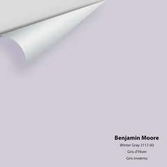
Winter Gray (2117-60)
For a neutral with nuance, we’re captivated by the original Winter Gray 2117-60: “Equal amounts of gray and violet come together in this gentle hue.”
Why we love it:
More interesting than a flat gray or beige; the violet undertone adds subtle character.
Great as a “quiet” anchor tone in a room, allowing furnishings and textures to shine.
Works beautifully with both cool and warm accents so whether your décor is cozy farmhouse or modern minimal, it plays well.
Tip: Because undertones show differently under different lighting, view a sample strip side by side with your trim and ceiling color to ensure harmony.


Winter Ice (866)
This light and refreshing hue brings a breath of clarity into the winter interior. The original Winter Ice 866 is described as having “crisp blue-green tones… brings to mind a frozen lake on a clear winter day.”
Why we love it:
Cool, clean tone that still feels peaceful and layered—not sterile.
Pairs wonderfully with whites, pale woods, and chrome for a modern wintry feel.
Offers a visual “pause” in an otherwise warm palette—like the glint of ice on a pond.
Tip: In rooms with warm lighting (like tungsten or Edison bulbs), this color may lean more aqua; in cooler daylight it may appear more blue. Sample accordingly.

Why Benjamin Moore Is Our Go-To
Advanced pigment quality and durability (Gennex® colorants) means true color, long-lasting finish.
Comprehensive color system: The winter palette program shows they thoughtfully select to the season what actually works in real homes.
Strong color-education resources: They help homeowners understand undertones, lighting effects, how to test so you’re empowered.
Final Thoughts from JAD
Start small: Before committing large walls, test large swatches. Light changes, other finishes in the room change, and what looks perfect at midday may look different at dusk.
Layer textures: Winter color palettes shine when paired with texture. Think wool throws, natural linen curtains, matte pottery, brushed brass. The paint is the backdrop; the décor pops.
Consider finishes: For walls, an eggshell or low-sheen finish keeps moderation in light bounce (especially important in winter when daylight is limited).
Coordinate trim/ceiling: If you choose a bold or dark wall color (like Evergreen Twilight or Frosted Slate Charcoal), consider keeping trim and ceilings lighter (like Frosted Horizon) to maintain visual balance.
Plan for the long-term: These colors aren’t just for December, they’re seasonal winners that will carry beautifully into spring and beyond.
If you’d like digital color boards, room-by-room suggestions, or paint-and-finish recommendations specific to your home (interiors or exterior), JAD is ready to help. Let’s bring winter in and let your space feel fresh, calm, and unmistakably inviting.
Here’s to a warm, beautifully-colored winter!


Comments